
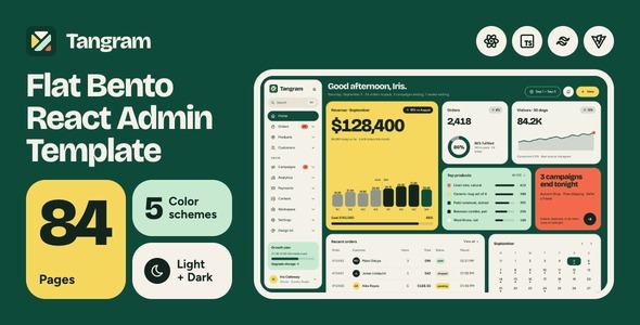
Tangram is a premium admin & dashboard template built as a standalone React 19 project, TypeScript in strict mode, React
Router 8, Vite 8, and Tailwind CSS v4, with 84 finished pages from a single design‑token core. It uses function components
and hooks throughout, with every route lazy‑loaded and every page typed, rather than markup wrapped in a component shell.
Real React, not a port
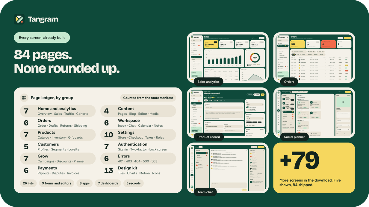
Every interactive part of the interface is a React component or hook, the island sidebar, dropdowns, dialogs, command
palette, off‑canvas customizer, chart wrapper, and map. There is no jQuery, Bootstrap, CSS‑in‑JS, or third‑party component
library whose look you would have to fight.
- React 19.2 · React Router 8.3, function components and hooks only; no class components anywhere.
- TypeScript 5.9 under strict, no any in the source. The route manifest is typed, so a bad slug fails the build.
- Vite 8 · @vitejs/plugin-react, instant HMR during development and a lazy chunk per route in the build.
- Seven runtime dependencies, with ApexCharts and Leaflet loading only on the routes that use them.
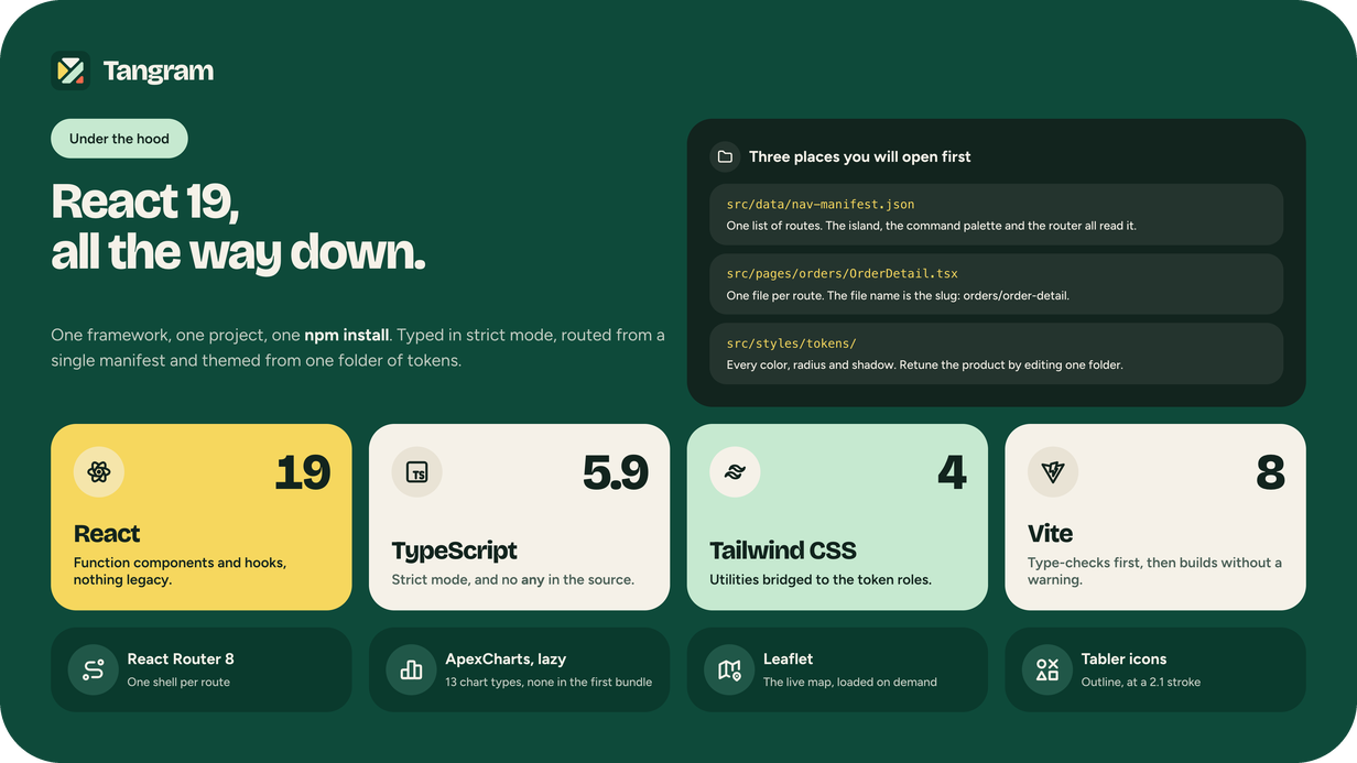
84 pages. Nothing rounded up.
They are all part of the same shop. Tangram isn’t a collection of sample screens pulled from dozens of industries; each
page belongs to a single small homewares brand. Thus, a figure on the dashboard matches the figure on its originating
order, and a customer on a list matches the customer on the record. 31 demo data files, one owner per number, nothing
random at render time.
- 7 dashboards: Home, Sales, Traffic, Products, Customers, Loyalty and Payments
-
26 lists: orders, drafts, returns, abandoned carts, catalog, collections, inventory, gift cards,
reviews, customers, segments, campaigns, email templates, discounts, affiliates, reports, transactions, payouts,
disputes, invoices, pages, blog, team, activity, roles and connected apps -
8 full-height apps: the shipping queue, customer messages, a social planner, the media library, the team
inbox, chat, a calendar and notes -
9 forms and editors: Add product, the campaign builder, the post editor, and six settings screens:
general, store, checkout, shipping zones, taxes, and notifications. - 5 records: order, product, customer, campaign and invoice, each one the detail page its list links to
-
7 authentication screens Sign in, sign up, forgot and reset password, two‑factor authentication, lock
screen, onboarding, plus 6 error pages: 401, 403, 404, 500, 503, and maintenance. -
A 13-page design kit, shipped as part of the product: tiles, buttons, inputs, selection, status,
navigation, feedback, tables, charts, icons, typography, the color schemes and the motion system - 3 standing pages: live traffic, your plan and the account profile
-
Charts, tables and maps: 13 chart shapes behind one typed wrapper, data tables with a compact row mode,
and a live Leaflet map
Five color schemes. Two themes. Two densities.
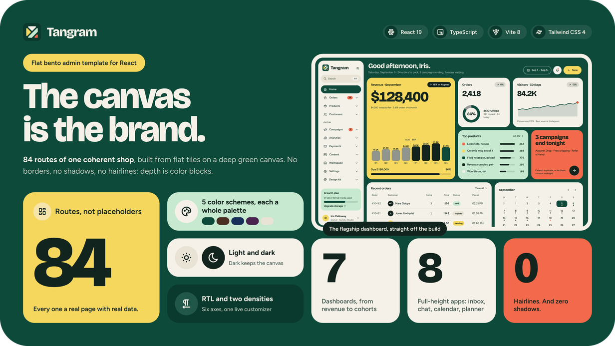
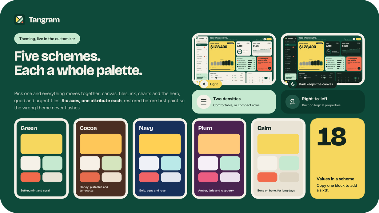
A scheme is a whole palette, not a background swap. Green, Cocoa, Navy, and Plum each recolor the canvas, the tiles, the
ink, the charts, and the three signal tiles together while keeping the signals functional. The hero tile appears as butter
on green, honey on cocoa, gold on navy, and amber on plum, every one stated at green’s lightness and chroma, so hero, good,
and urgent elements read with the same strength wherever you land. A fifth scheme, Calm, is bone on bone for those who
prefer a quiet version. Additional options include a dark theme (canvas stays, tiles turn ink), comfortable and compact row
heights, and an expanded or rail island.
The design language, up close
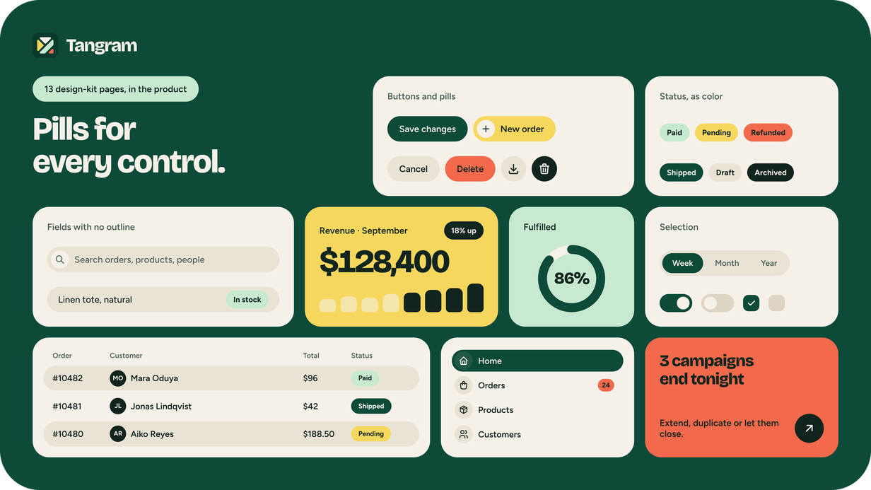
Flat, chunky, joyful, and exact. Bricolage Grotesque sets the numerals at display weight; Figtree sets the text at 14 px.
Tabler icons have a 2.1 stroke and always appear inside a pill. Tiles appear with a 50 ms stagger, bars grow, lines draw,
rings sweep, and counters tick up once, all behind prefers-reduced-motion and never on the sticky chrome, which would break
the page on every navigation. 28 UI primitives and six shared page bodies are documented in the design kit that ships
inside the product.
Engineered, not skinned
-
One token core. Color, radius, and type resolve from a single folder of token files. Components carry no values, so a
re‑theme is a token change, not a find‑and‑replace, and a check script fails the build on a literal color in a component. -
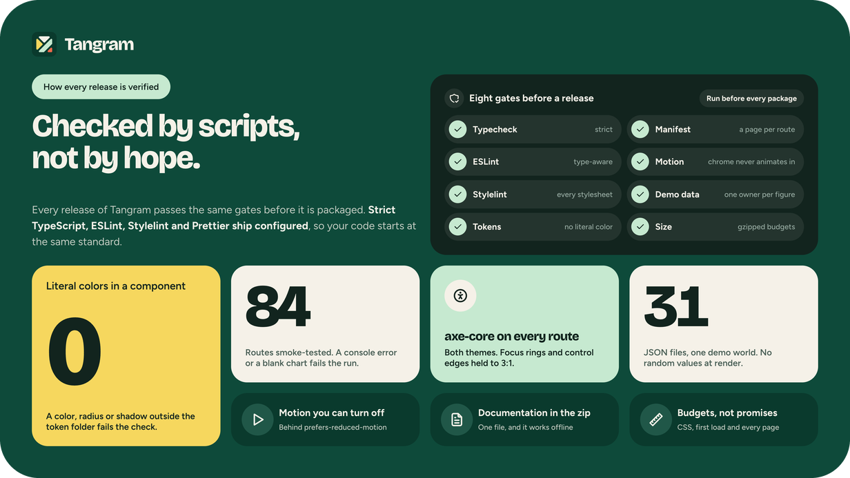
WCAG 2.1 AA, audited rather than asserted. Every text pair and every non‑text pair, a control boundary, a focus ring, a
bar, a ring, a chart series, meets the threshold in both themes, at both densities, and across all five schemes. Verified
with axe‑core on all 84 routes, plus a pass that focuses each control in turn and measures its ring against the
background. -
Real RTL. Logical properties from the start, not a stylesheet mirrored later. The entire app flips, including charts and
island. -
One route manifest. 84 routes come from a single JSON file, read by the island, breadcrumb, and command palette. Adding a
page adds a slug and a file. -
Pages stay simple. A page never imports the router, never reaches for a context, or calls fetch; it simply takes data and
renders. Check scripts enforce all three. -
Light on the wire. Only 26 KB of CSS and 115 KB of gzipped JavaScript load initially, including React. Charts and the map
are split into separate chunks that load only when needed. -
Eight gates before a release. Strict typecheck, ESLint, Stylelint, token, manifest, motion, demo‑data checks, and gzipped
size budgets are all configured in the download, so your code starts where the template’s does.
What’s included
-
The complete React project in template/, src/, public/, index.html, package.json, vite.config.ts, the TypeScript configs,
and a buyer README. - All 84 routes, off one shared route manifest
- The full design-token core is documented: five color schemes (light and dark) and two densities.
- The 13-page design kit consists of pages you can open and read in the running app.
-
HTML documentation: getting started, installation, project structure, theming, adding pages, and deployment, one file,
working offline. - License and credits inside the documentation
Requirements
- Node.js 20.19+ or 22.12+ (minimum version required by Vite) | npm, Yarn, or pnpm
- Nothing on your server
npm run buildemits static files
Documentation & support
The template includes step‑by‑step setup, theming, and deployment docs. Questions are welcome through the item’s Comments
& Support tab.
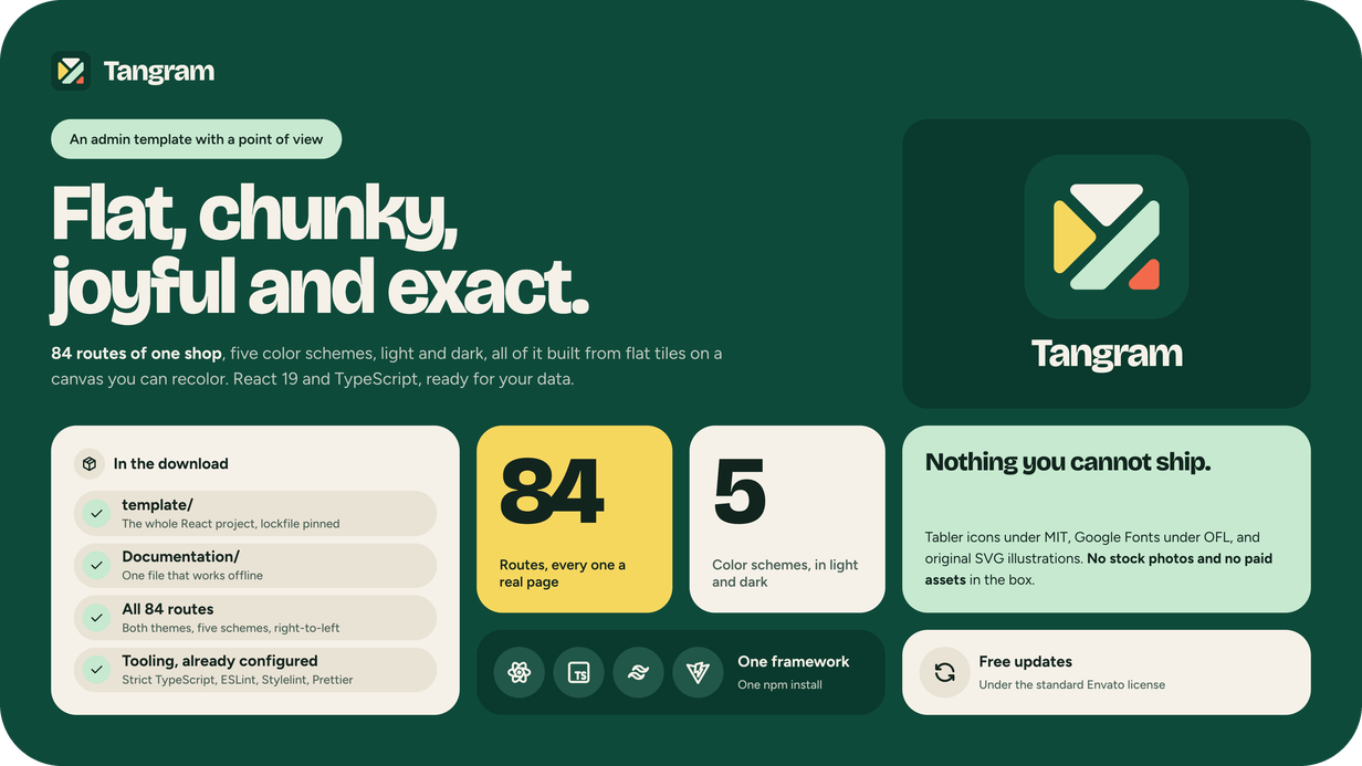
Note: the demo avatars and illustrations are original SVGs created for this template and are provided for preview only;
replace them with your own before publishing. No stock photos or paid assets are included. Tabler icons (MIT), the Google
Fonts used for display and body text, Bricolage Grotesque and Figtree (both OFL), and the bundled open‑source libraries
are credited in the documentation.