Introducing the InFo: All-in-One Solution for Personal Portfolios and Resumes


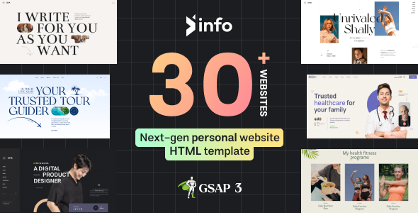
Unleash your creativity with the InFo Template, a versatile platform that offers 35 unique demos for crafting your very own personal website. This remarkable template comes equipped with a range of exceptional features, including Dark and Light Modes, Box Layout, RTL Ready compatibility, and a groundbreaking GSAP animation feature. We refer to our animation capabilities as ‘animation builds,’ allowing you to create and customize animations effortlessly by modifying HTML data attributes.
With 30 distinct designs, each page offers a unique look and feel. We’ve meticulously curated this diverse selection to ensure that you find a demo that perfectly matches your professional style.
Boasting nearly 300 inner pages, you have the freedom to mix and match, selecting any pages to create a tailored demo that suits your needs. Explore our assortment of 20+ about pages, service pages, contact pages, portfolio pages, and more. Customize your website down to the finest detail by hand-picking specific sections.
hat sets the InFo Template apart are its captivating animations and smooth scrolling features. Tailor the animations to your liking – change their style, add parallax effects, introduce data lags, and modify duration, delays, and ease functions. InFo puts you in complete control of your website’s dynamic elements, providing a captivating and memorable user experience.


Info is a versatile and responsive personal portfolio template designed to showcase your creativity. Whether you’re a developer, engineer, designer, content writer, instructor, photographer, freelancer, politician, software engineer, teacher, or any other professional looking to showcase your skills and creative work, Info is the perfect choice. This template is thoroughly documented, easy to use, highly customizable, optimized for fast loading, and delivers excellent performance.”
It is an entirely new and trendy design based on award-winning design concepts with eye-catching animation and smoothness. If you start scrolling any page, you are never going to stop as it will give you more and more flexibility and smoothness.
You will be able to customize every part of this template including animation, cursor, dark and light, and many more. We have very rich documentation for specifically for this template so that you will be able to customize everything if you know just how to change a code.
The layout looks beautiful at any size, be it a laptop screen, iPad, iPhone, Android Mobile, or tablet. Axtra is created and tested in all devices and browsers like Firefox, Chrome, and Internet Explorer and it works perfectly without any issue.
Features Overview
-
Responsive Layout Design:
Whatever you are using the device your site will run as it should be. The Axtra template is a fully responsive
layout for all types of devices.
-
Custom Blog Templates:
There are 3 different bogs layouts and 2 blog details layout.
-
Bootstrap Framework:
Bootstrap is the most popular HTML, CSS, and JS framework for developing responsive, mobile-first projects on
the web.
- It comes with 3+ Home Variation.
- Next Generation Animation Builder
- Award Winning Design concepts
- Smooth Scrolling Effect
- 4 Different Navigation
- Sticky Navigation
- Clean & Commented Code
- Advanced Typography
- 100% Fluid Responsive – Fits any device perfectly
- Tested on real devices
- User-friendly interface
- Flexible Layout
- Flat, modern and clean design
- Mobile-friendly mobile menu
- More demos are coming
- Dark & Light Layout
- Built with HTML5 & CSS3
- Blog Modal
- Portfolio Modal
- Sass Available
- Perfect Responsive
- Build with Bootstap 5
- Developer Friendly Code
- W3 Valid 100%
- Fast Loading Speed
- Well Documented Codes
- Cross Browser Support
- Modern Design
- Google Fonts
- It’s very easy to use
- Dedicated Support, Lifetime Updates
- And much more


